This time we will review some helpful resources for designers, how you can find them, and how can they help you.
Have you ever thought that every day, while you are busy doing your work, there are a lot of people doing almost the same thing as you? And they are releasing it. For free.
And sometimes we just forget all this stuff and lose a lot of time doing things that just didn’t need to be done. Someone else has done it for us. Why should you start from scratch if you can get some cool things and just make them better?
So, this is a post with a lot of links, and with my opinion about many of them. In short, we will be talking about:
• Creative photos collections
• Cool Icon packs, Buttons & Menus
• Professional Font faces
• Useful patterns, brushes, backgrounds, textures
• Templates and other miscellaneous elements
• Online generators and other tools
So, let’s rock!
Creative Photo Collections

Actually, most of you always use stock photos in your layouts. Yeah, they are nice, but many of them just don’t get the point across that you want. Don’t get mad, they don’t ruin your work. But they don’t make it brilliant either.
So, usually you have 2 options:
- Use premium stock photos
- Take your own photos
I think there is a third option that we almost always forget: Some really artistic and creative photos out there.
We have a lot of photo collections, with photos for specific situations. Think about it, when you are talking about victory, for example, it’s much better to use a real emotional winner photo than a commodity clip art trophy image.
Why they are good: Using in-context funny or emotional images is the easiest way to get your reader’s attention, so you get more time to explain your point.
What you should pay attention to: You must pay attention in copyright notices for images. We can’t steal someone elses image just because it is on the web.
Good Start points:
- Search for: Photo manipulations, Photo manipulation tutorials, [type] photography (“tilt-shift photography”, for example), [type] examples, [type] showcase, [type] collection
- 1StWebDesigner (Photography inspiration) – I think you heard about this blog before, it is amazing, isn’t it?
- From me to you – Jamie’s photography blog, with some amazingly amazing gifs
- Instant Shift (Photo search) – Artistic photo manipulations galleries, like this 80 excellent example of photo manipulation art.
- The design work (tag photos) – Fascinating photo collections, like this panoramic photography gallery
- This Ain’t no Disco - Cool workspaces galleries. As they say “Try not to drool too much”.
- VanderlayDesign (photo search) – Good for design inspiration in general. You should check this cool rain photography collection.
- Web Designer Ledger (photo search) – Really good for inspiration. Check this awesome photography shots to change your mood!
- Flickr (Creative Commons) has always really good photos, and a powerful search engine, that make things even easier.
- TotallyCoolPix, as its name says, is focused on cool photography. This sports pictures collection, for example, is really useful!
- We have also this 10 most inspirational deviantart groups (really good, seriously, you must to check this out).
- Some traditional free / paid stock photo sites like Veer, Public-Domain-Photos, Pixel Perfect Digital, Image After, Design Packs, Free Range Stock, Cepolina, Stock.XCHNG, Morguefile, Toasto and others, are also always a good source.
- Last but not the least, Haznos.org/images (brazilian blog, with google translated version) has a lot of cool collections, like this funny bikes gallery
Cool Icon Packs, Buttons & Menus

Sometimes we need an idea of how could we put those 20 links that the customer wants in a really good-looking menu. Moreover, you have to worry about all the “call to actions” and semiotics stuff for icon and button design.
When you feel like this, it is time to steal someone elses design :D
Why they are good: Depending on the site you use to search, it is possible to find really complete icon packs, with “generic” icons for customization (just the background, for example). Many people may have solved the problem with 30 links in the same menu already.
What you should pay attention: It is worthless to find a really cool icon pack, button or menu that you don’t know how to customize. So, if you get a cool wooden icon pack, but don’t know how to make a “home” icon (maybe it is missing), you can’t use it.
Good Start points:
- Almost every good design blog has an “icon” section, or icon tutorials, they are helpful.
- DryIcons - Free and good icon packs
- HouseOfButtons has the best buttons seen in the web
- Really useful mega buttons pack
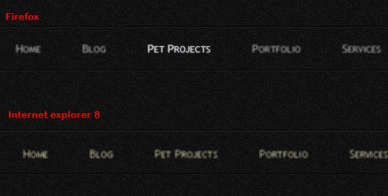
- Awesome blurry menu by 1stWebDesigner
- Simple navigation PSD by designdeck
- 10 best icon search engines by savedelete
- 50 high quality and free to use minimalist icon sets by smashingapps
- 47 Clean and High Quality Icon Packs for Designers by onextrapixel
- Simple tabbed navigation in psd by premiumpixels
- Dark navigation in psd by premiumpixels
- Cool Basal icons pack by designkindle
- Clean Social icons by folksnetdesktop
- Fresh icons sets to improve your design by noupe
- Top 10 country flag icon sets by speckyboy
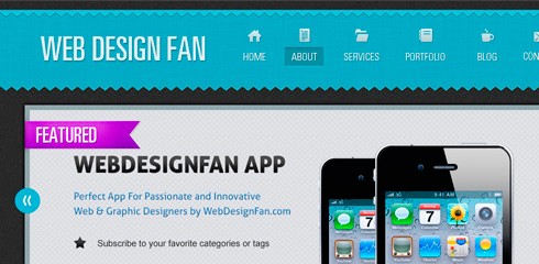
- 20 examples of great navigation by webdesignfan
Professional Font Faces

I have to tell you a secret. I don’t know anything about typography. For real. I know just the basics, that serif and sans-serif stuff, but anything beyond this, don’t count on me.
Everytime I read something about typography I get amazed on how this is a wide field to study. And how we are getting better and better at it.
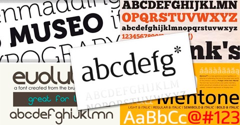
With all this @font-face stuff, it is almost a crime to not use a really professional font in your headlines (at least) without fear of the monster of cross-browser compatibility.
Why they are good: They give a really professional look to your project and they are easy to use.
What you should pay attention: You should notice copyright restrictions (yeah, not every font is free), and whether or not the font you want has some special characters (it is hard to find, for example, c with cedilla or grave accent, really used in Portuguese).
Good Start points:
- We have a lot of free font download sites, like dafont, 1001 free fonts, acidfonts, urbanfonts, fontstock and much more, just google it :D .
- Abduzeedo’s friday fresh free fonts series – 99 episodes in this series, so you have a lot of fonts to try.
- Design instruct (Jacob gube’s posts) – I don’t know where he finds those fonts, but they are just amazing.
- HongKiat (fonts search) – Some really good collections!
- 1StWebDesigner awesome minimal fonts collection and professional fonts collection.
- WebDesignerLedger (fonts search) – Some good ones, like this 11 fonts collection.
- Massive collection of elegant thin fonts and 30 of the best font foundries by webdesignerdepot
- 25 popular websites to download free fonts by djdesignerlab
- 40 beautiful free fonts for creating attractive typography headlines, 30 free fonts which are perfect for professional logo designs and 30 top best free fonts from 2010 by creativenerds
- 15 free high quality fonts for minimal designs by slicescript
- 25 free fonts perfect for fontface revived by speckyboy
- 30 websites to download great fonts and 15 free graffiti fonts for your design needs by reencoded
- 30 free script fonts for calligraphy and 35 free grunge fonts for abstract designs by visionwidget
Useful Patterns, Backgrounds, Textures

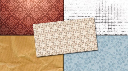
Yeah, I love patterns and textures. I used to download patterns because some of them I just don’t know how to create myself, and sometimes I just need a preview of how the work would look with that pattern. Actually, there are so many combinations of patterns, textures and brushes that you could spend all your life just trying combinations. So it is better just to pick some good samples, isn’t it?
Why they are good: They save you a lot of time, with complex and tiled patterns.
What you should pay attention: When you use a texture for websites you have to pay attention in their screen size, because we have a lot of different screen dimensions nowadays, thus many users can see that ugly white background when your texture ends.
Good Start points:
- Previously said photo stock sites (actually a texture can be a photo :D)
- Subtlepatterns, Patterncooler – Whole sites dedicated to patterns!
- 41 free texture packs and other textures (texture search) by designm.ag
- visionwidget’s free HQ photos – like this awesome wooden textures colection
- Vanderlaydesign (texture search)
- Myinkblog (textures category) – Really good collections, like this 7 High Resolution Stone Textures
- WebDesignerDepot patterns and textures – like this funkies patterns collection
- 20 great resources download free patterns by makeuseof
- Best free textures and patterns of 2010 by webdesignledger
- 60 beautiful high resolution paper backgrounds by photoshoproadmap
- A collection of free carpet textures by naldzgraphics
- 50 free wood textures for your designs and 45 awesome abstract textures by reencoded
- 1000 grunge photoshop brushes (Yeah, brushes, why not?) and 50 fantastic textures for your toolbox by speckyboy
- 34 must have texture packs for web designers by inspiremonkey
- Awesome collection of 60 high quality free textures by pelfusion
- 34 pebble textures for a cool round up of design choices by naldzgraphics
- 35 free adobe illustrator patterns sets a designer should use by designresourcebox
- 35 free abstract background pattern and texture designs by designmodo
Templates and Other Elements

Yeah, we have a lot of other elements ready to use, that couldn’t be in above list. There are a lot of boxes, ribbons, slide shows, form elements, complete page templates and many other things that you could use in your work. There are a lot of creative design solutions for problems that we all could pass (like slide shows, or complete admin panels), and with this samples, you save a lot of precious hours.
Why they are good: They surely save you a lot of time, and brings you inspiration for common problems.
What you should pay attention: For every element we have a lot of possibilities, and many of them could be good. You don’t have to find a magical unique solution for everything, for each problem there’s more than likely a solution out there. This is why we have so many links in here :D
Good Start points:
- Some good sites like NetTuts+, DesignInstruct and Freepsdfiles.net are full of good samples and elements
- 10 useful search engines for graphic designers by blog.medhley.com
- 50 stunning pixel perfect psd freebies by inspirationfeed
- Create a portfolio web layout in photoshop by webdesignfan
- Free travel and hotel website templates and Web design elements psds for user interface design by visionwidget
- 30 energy infused free photoshop web design psd files by creativefan
- 50 creative web interfaces from deviantart by reencoded
- 25 photoshop web layout design tutorials by designmodo
- Best sites for web resources by inspiredology
- 50 free psd ui kits and templates for web designers by speckyboy
- Awesome Html5 admin template by medialoot
- Free admin skin available for download by netdreams
- Free html/css & jquery admin panel inadmin by indeziner
- GUI free css template by chocotemplates
- Free admin template by Mathew Davies
Are You Hungry Yet?
I know that you have some useful links to share too. Why don’t you put them in comments, or write a response in your blog?
I’m sure that we will always need new sources to make our designing process more effective.
"

No comments:
Post a Comment